Color
Our palette is warm and restrained. Most of what we make is warm white, near-black and red, with soft greens and blues in support.
Colors
Warm white, near-black and red lead every execution. Red belongs to the wordmark, headlines and key moments; warm white and near-black do the everyday work.
The rest of the palette comes in pairs: a soft tone for backgrounds and a deeper tone for type and details. Yellow is reserved for highlights on screen.
- HEX
- #B3CDB2
- RGB
- 179/205/178
- CMYK
- 31/8/34/0
- HEX
- #5D7A60
- RGB
- 93/122/96
- CMYK
- 42/8/48/46
- HEX
- #82AAB6
- RGB
- 130/170/182
- CMYK
- 51/22/24/0
- HEX
- #3D7887
- RGB
- 61/120/135
- CMYK
- 78/41/38/8
- HEX
- #D62626
- RGB
- 214/38/38
- CMYK
- 10/98/100/1.5
- HEX
- #A00E0C
- RGB
- 160/14/12
- CMYK
- 24/100/100/21
- HEX
- #FBF9F6
- RGB
- 251/249/246
- CMYK
- 1/1/1/1
- HEX
- #D4E1E1
- RGB
- 212/225/225
- CMYK
- 8/0/3/6
- HEX
- #25100A
- RGB
- 37/16/10
- CMYK
- 23/45/45/94
- HEX
- #634335
- RGB
- 99/67/53
- HEX
- #FDF151
- RGB
- 253/241/81
Color Combinations
Our colors work together in many combinations. Pair a background with a type color that has plenty of contrast, and keep each layout to two or three colors.
Soft tones pair best with their own deeper tone, with red or with near-black.
Are You Waiting…?
Tuning a Self-Truth
Zaïna Gaza
A free newsletter with updates, op-eds, and cetera.
No Agent Necessary
Sit on your window sill, listen to soft acoustic music on a speaker and watch the droplets fall to the pavement.
Color in Photography
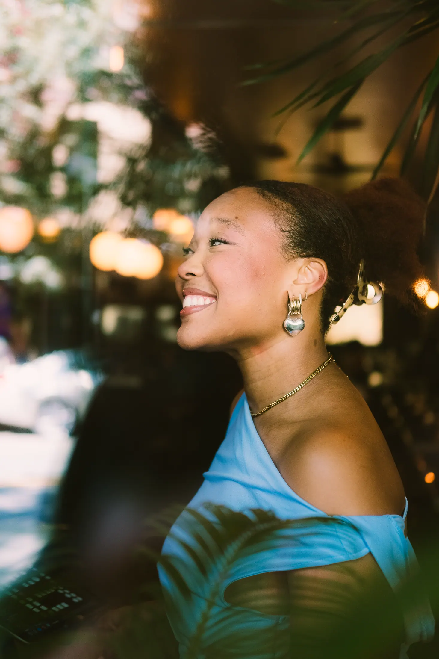
Our photographs bring their own color. When type or graphics sit next to a photograph, take their color from the palette that is closest to the image.
Warm images lean toward red and warm white. Greener, cooler images lean toward our greens and blues.


Accent Colors
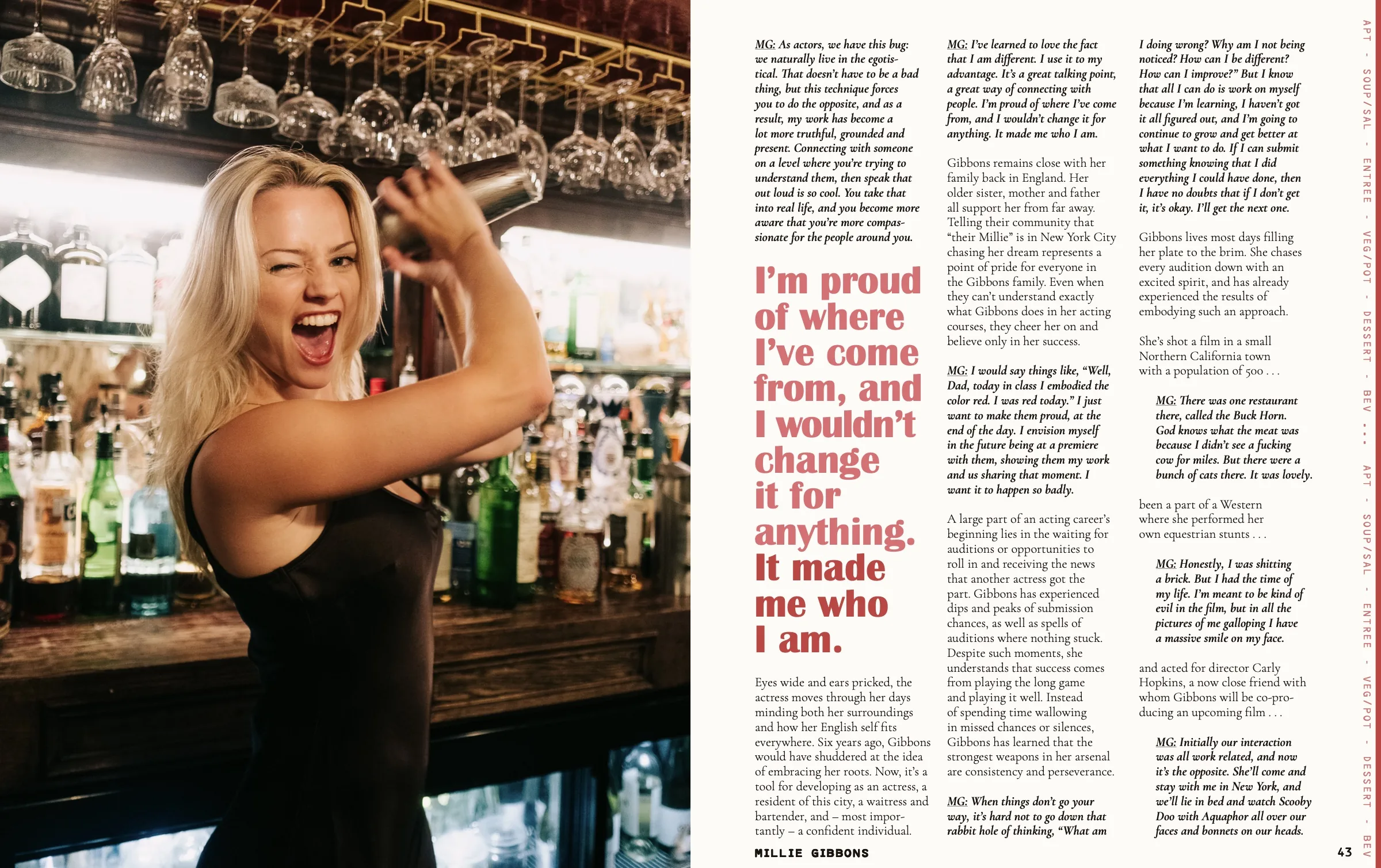
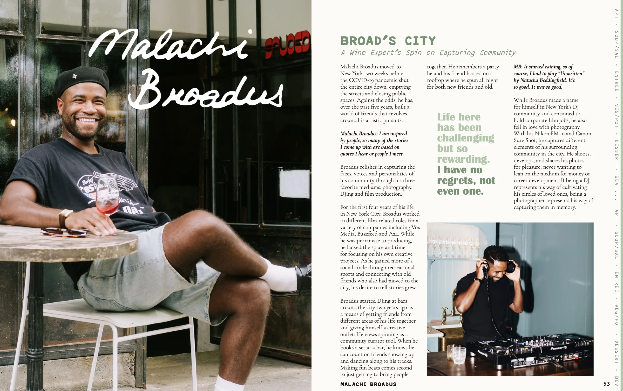
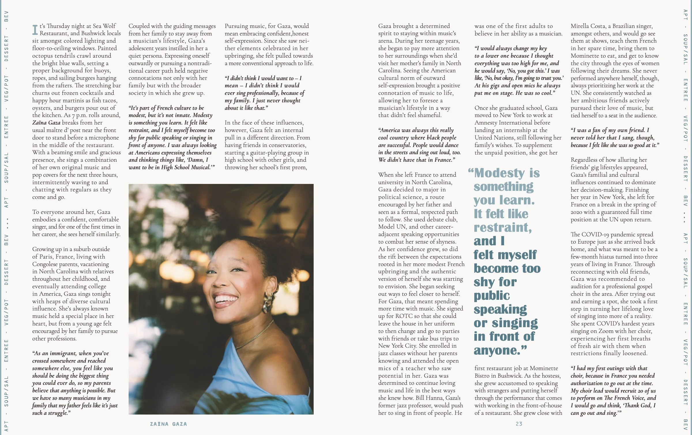
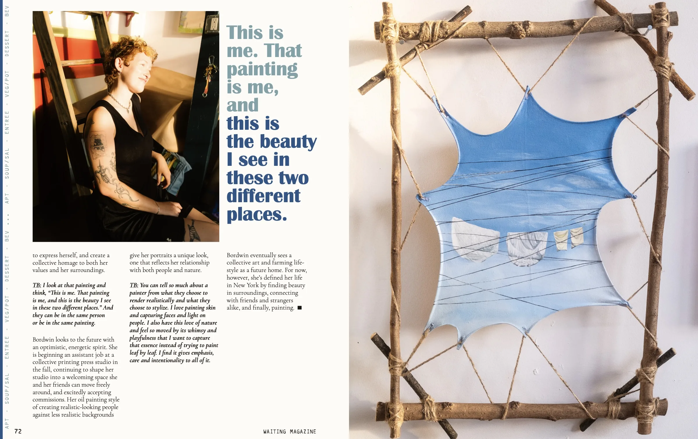
Each feature takes one accent color from the palette. It carries through the artist's name, the title, the deck, the hero quotes and even the side ticker on the web.
Choose the accent from the photographs. Across our stories, red, green and blue each lead in turn.
Occasional Colors
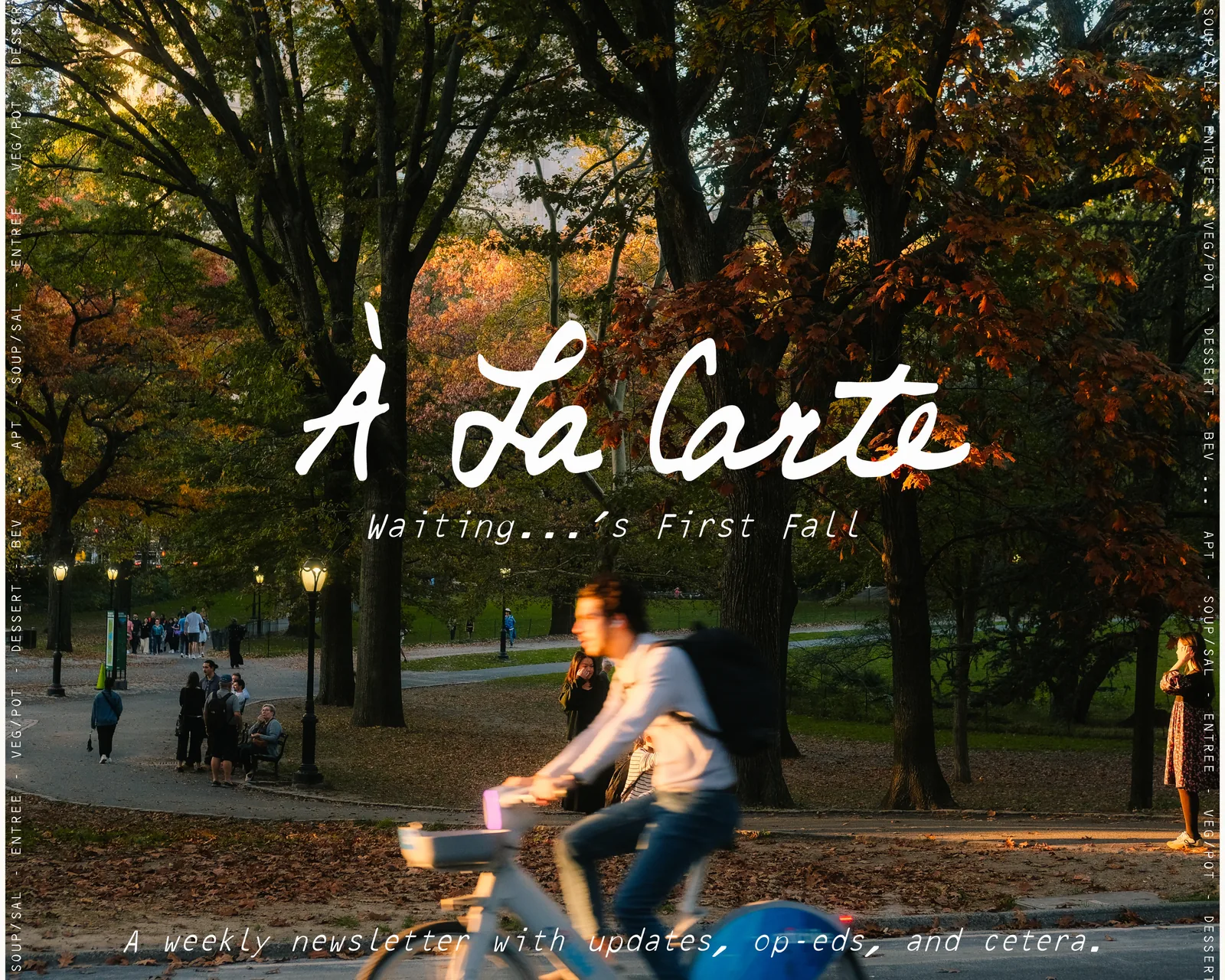
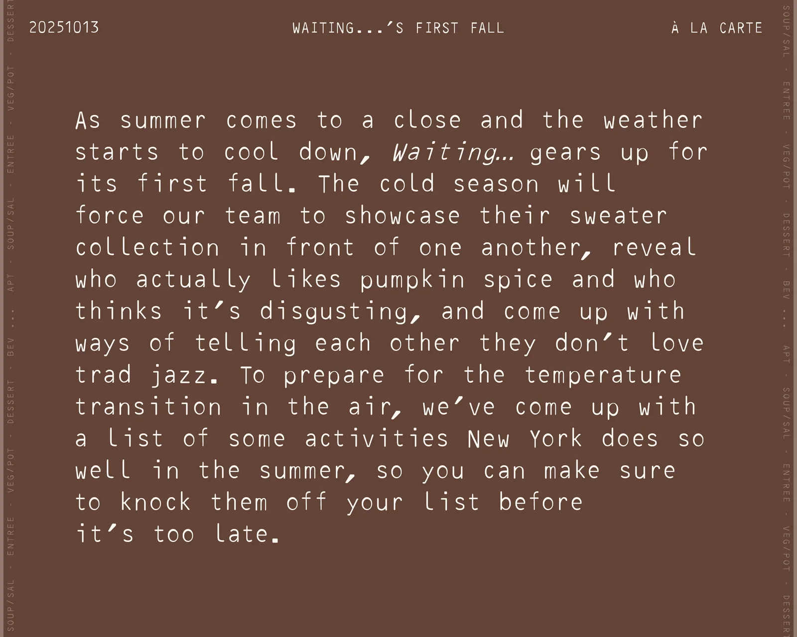
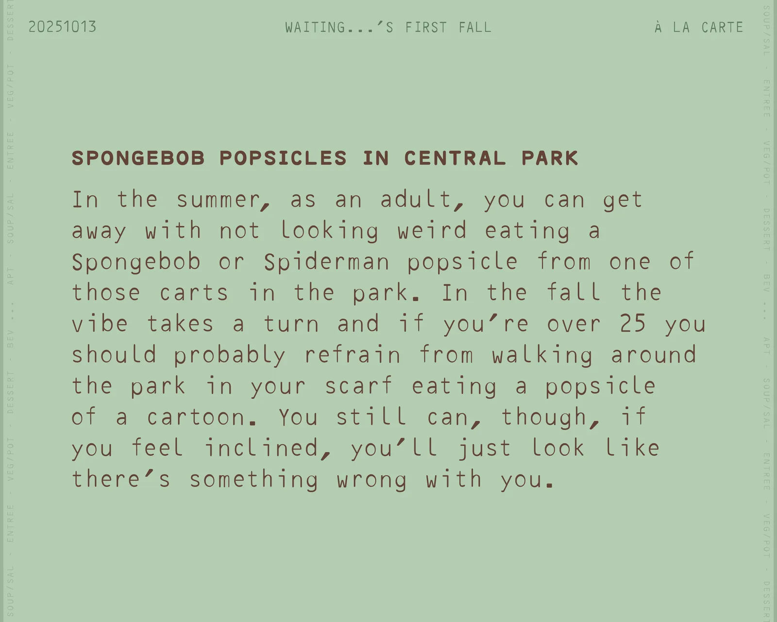
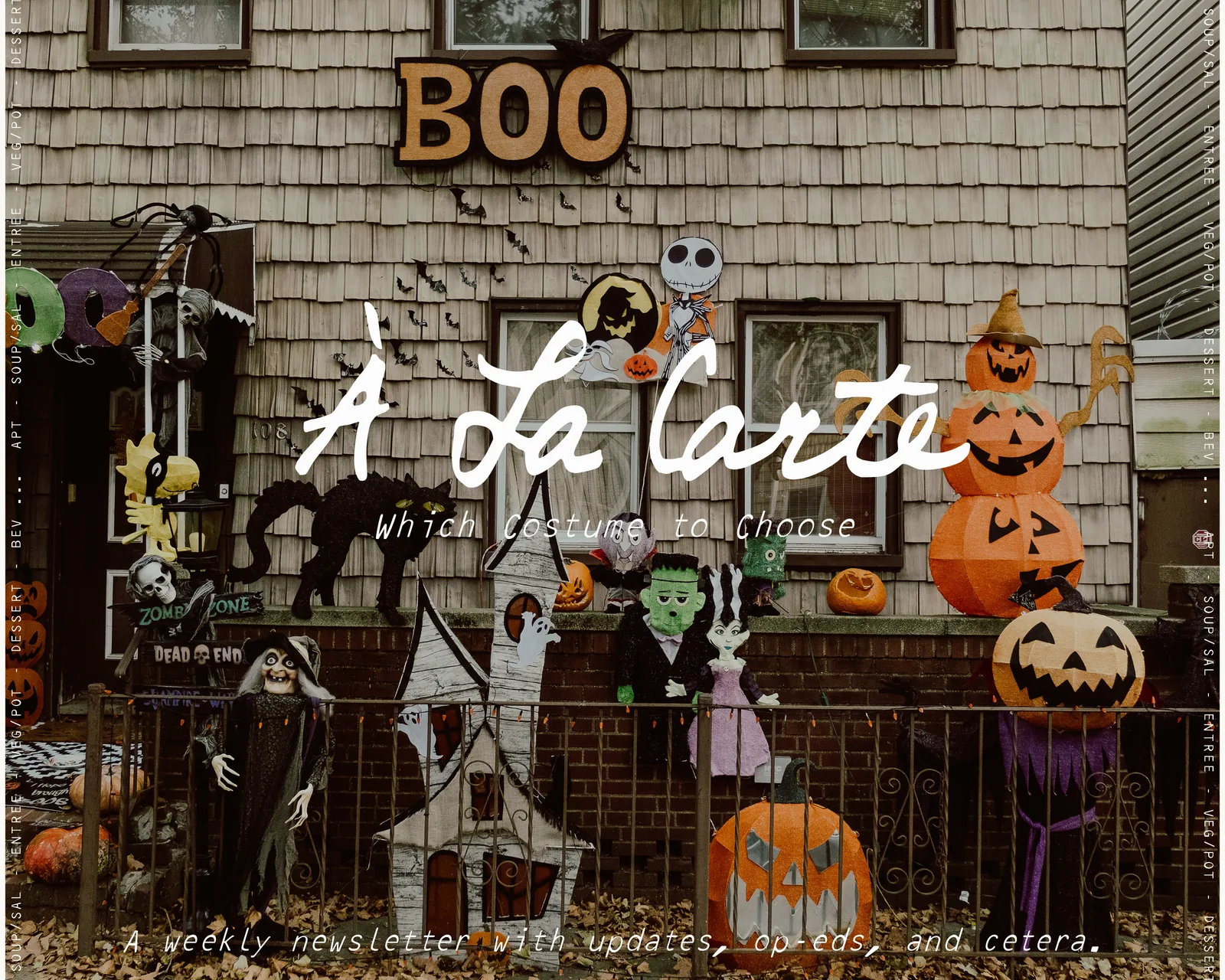
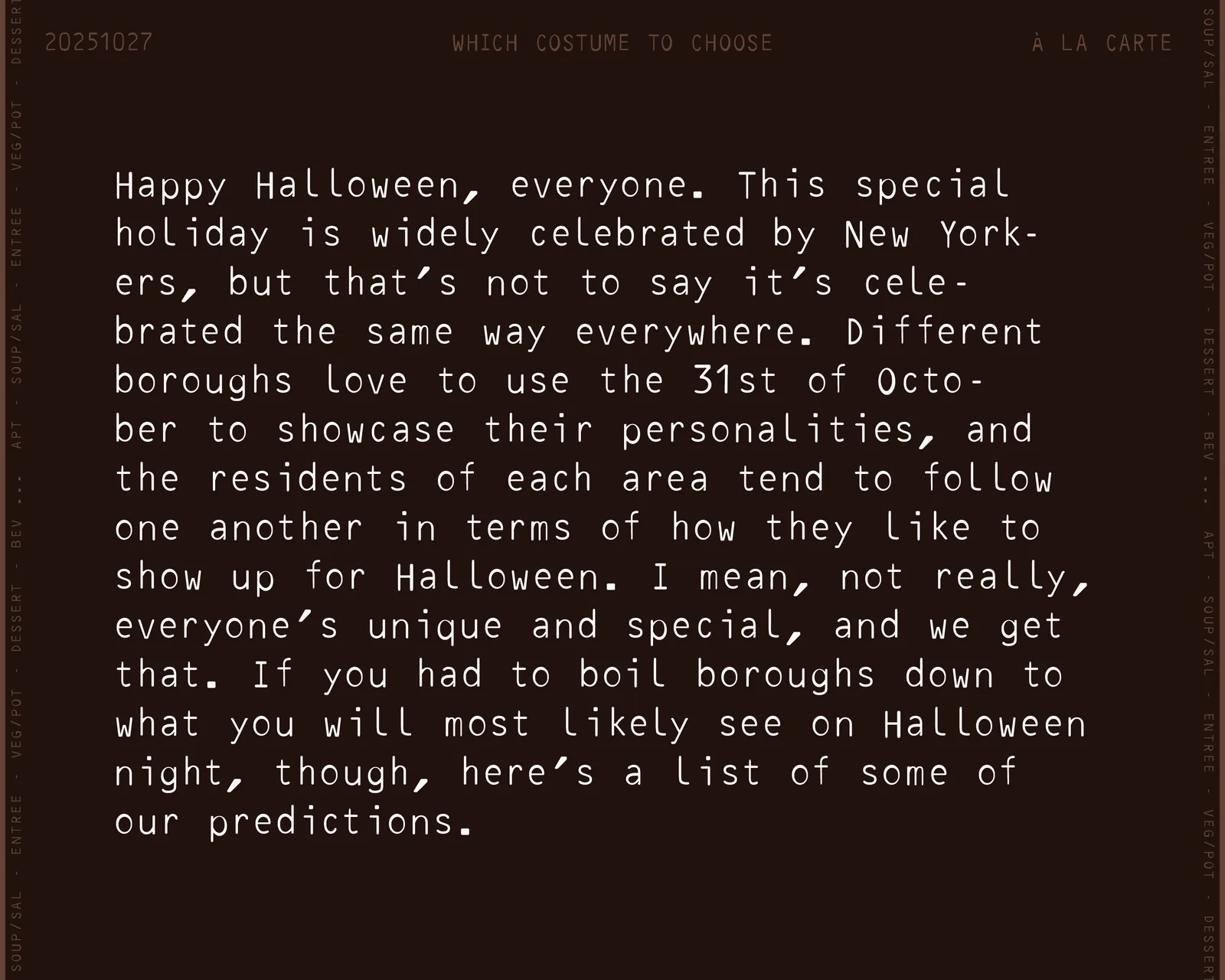
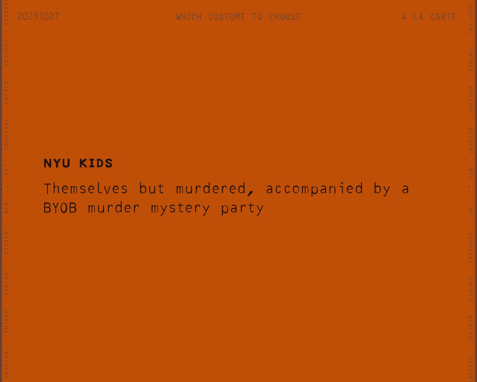
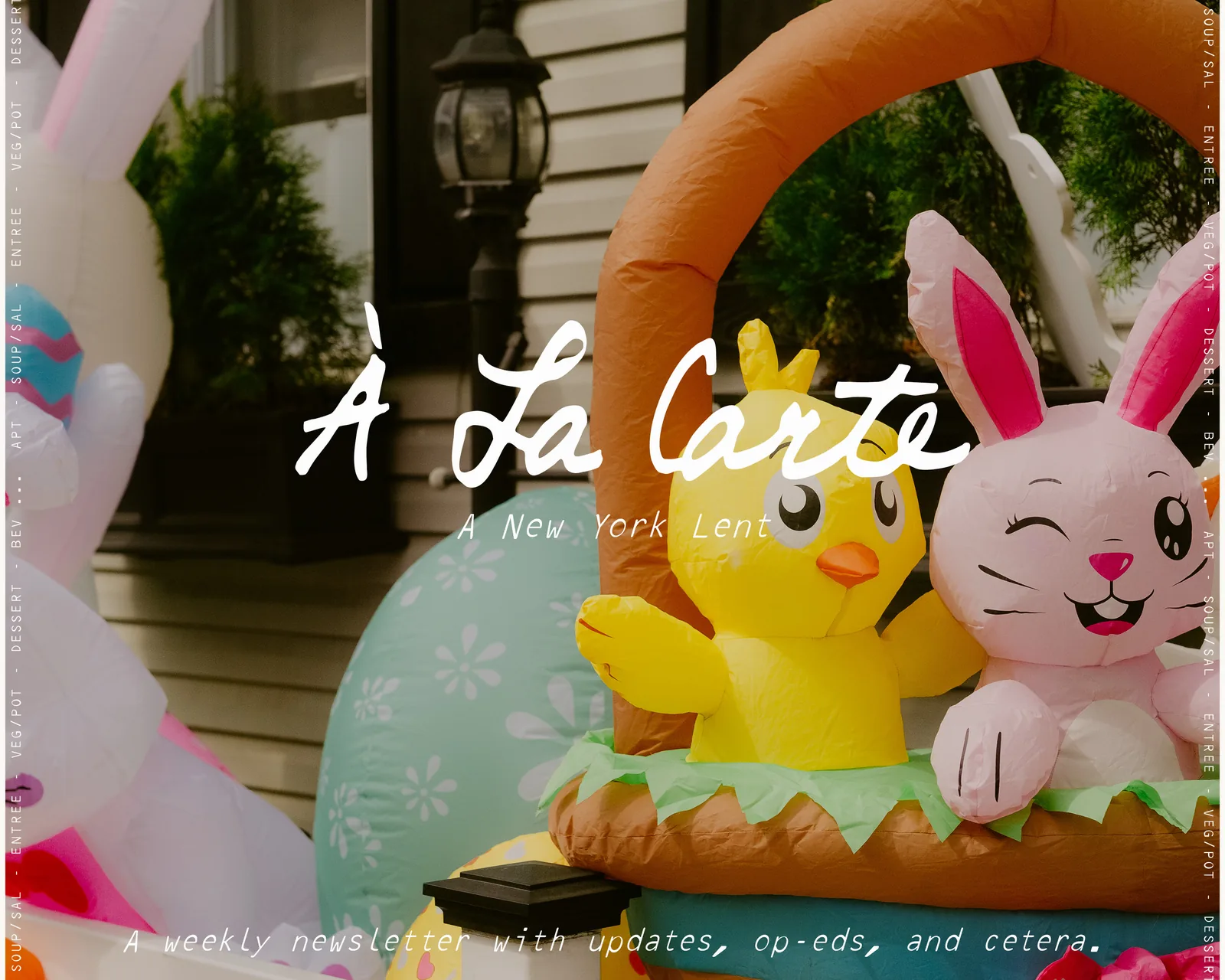
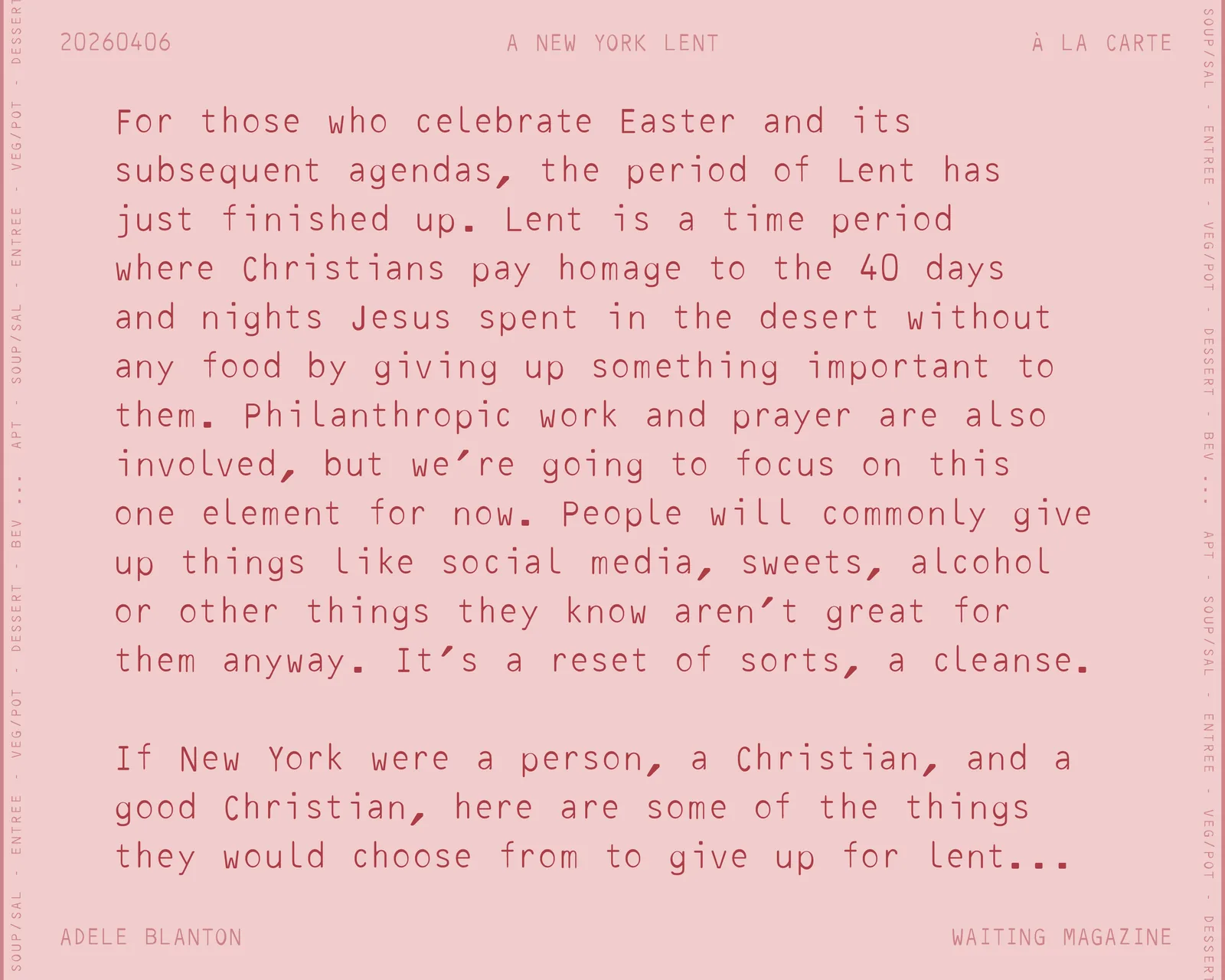
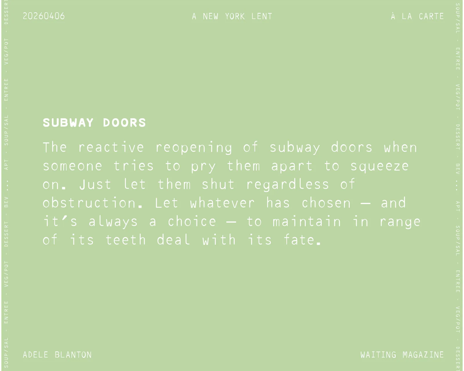
For holidays, seasons and special issues of À La Carte, we step outside the palette. The structure stays the same: the top rail, the date, the series title and the typewriter text. Only the ground color changes.
Choose colors that belong to the occasion, keep contrast high and return to the core palette afterward.
First Fall
À La Carte, 20251013
Halloween
À La Carte, 20251027
Easter
À La Carte, 20260406
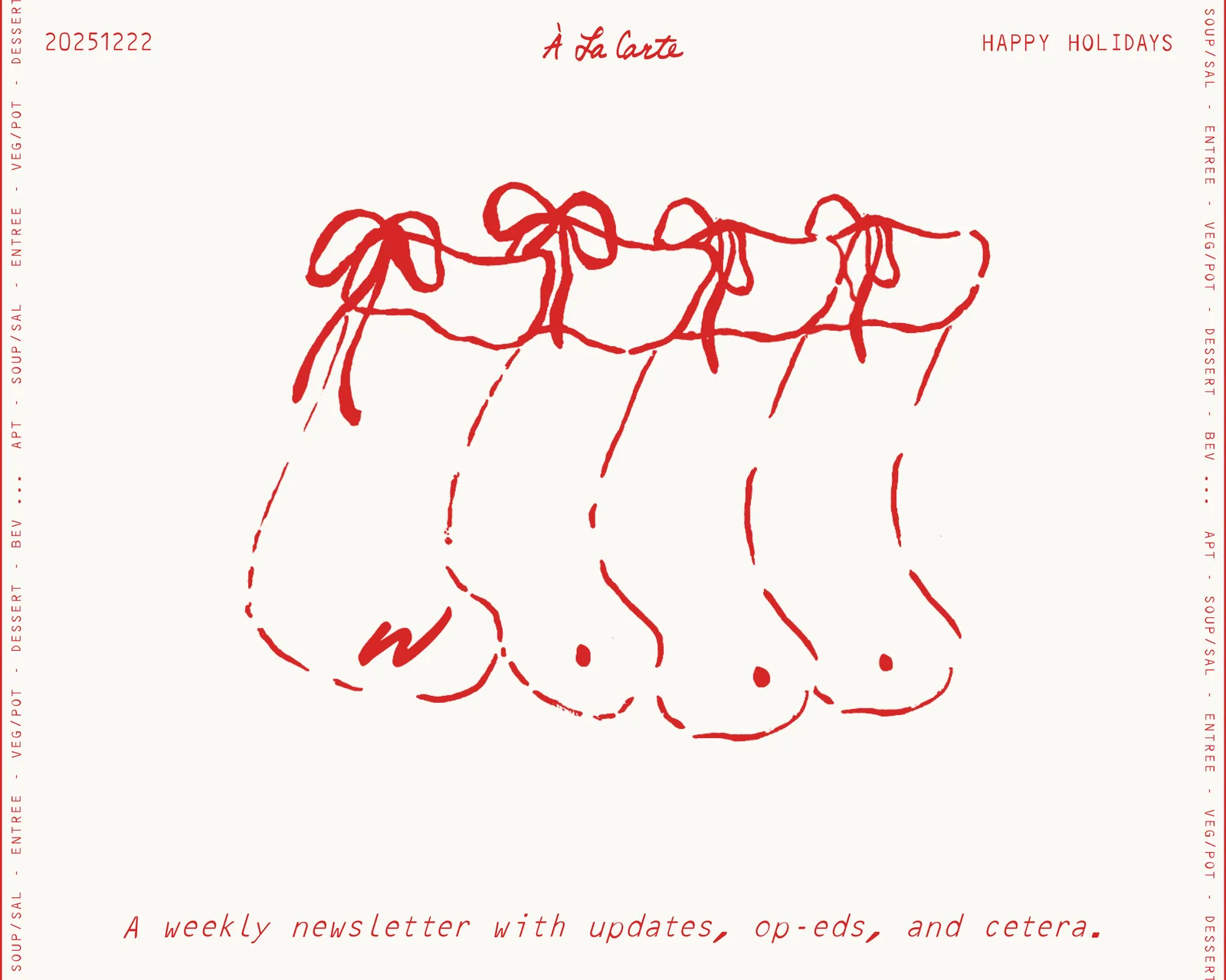
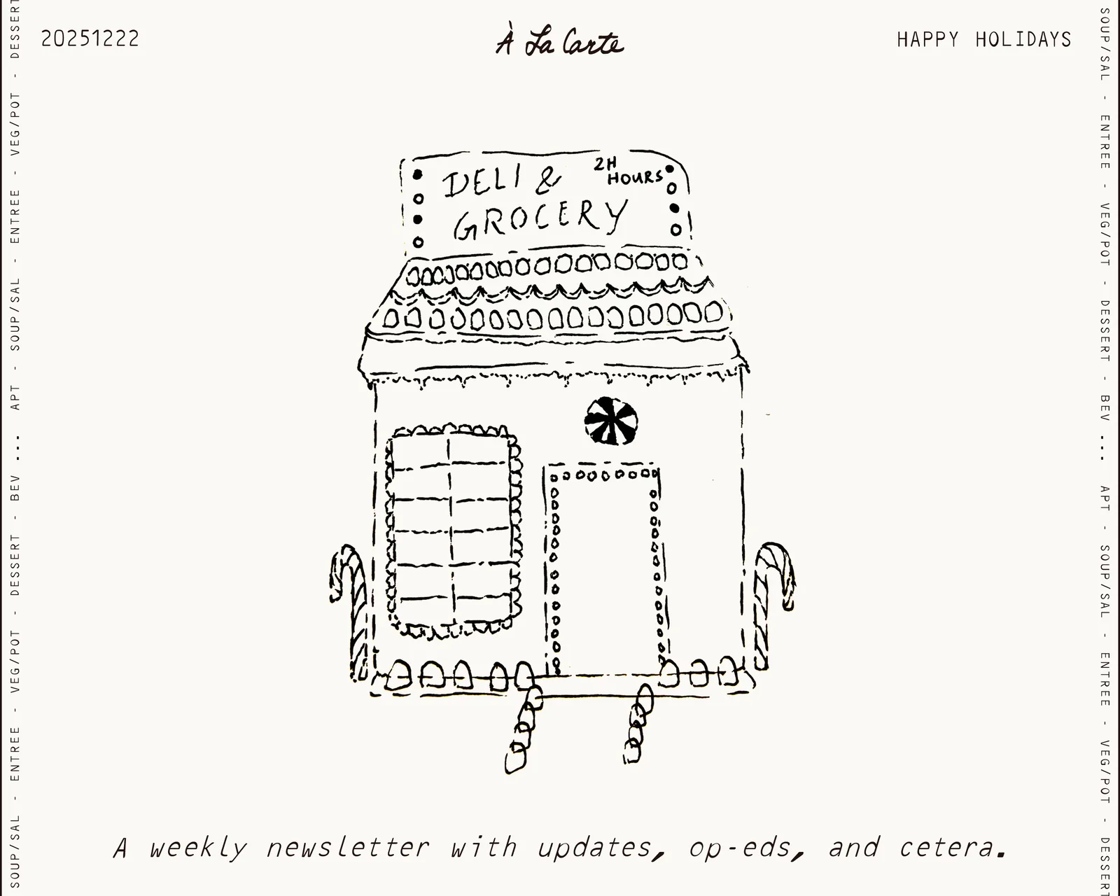
Holidays
À La Carte, 20251222
For the holidays the palette stays core. Red illustrations and a seasonal version of the wordmark carry the occasion.