APT - SOUP/SAL - ENTREE - VEG/POT - DESSERT - BEV ... APT - SOUP/SAL - ENTREE - VEG/POT - DESSERT - BEV APT - SOUP/SAL - ENTREE - VEG/POT - DESSERT - BEV ... APT - SOUP/SAL - ENTREE - VEG/POT - DESSERT - BEV APT - SOUP/SAL - ENTREE - VEG/POT - DESSERT - BEV ... APT - SOUP/SAL - ENTREE - VEG/POT - DESSERT - BEV

APT - SOUP/SAL - ENTREE - VEG/POT - DESSERT - BEV ... APT - SOUP/SAL - ENTREE - VEG/POT - DESSERT - BEV APT - SOUP/SAL - ENTREE - VEG/POT - DESSERT - BEV ... APT - SOUP/SAL - ENTREE - VEG/POT - DESSERT - BEV APT - SOUP/SAL - ENTREE - VEG/POT - DESSERT - BEV ... APT - SOUP/SAL - ENTREE - VEG/POT - DESSERT - BEV ...

APT - SOUP/SAL - ENTREE - VEG/POT - DESSERT - BEV ... APT - SOUP/SAL - ENTREE - VEG/POT - DESSERT - BEV APT - SOUP/SAL - ENTREE - VEG/POT - DESSERT - BEV ... APT - SOUP/SAL - ENTREE - VEG/POT - DESSERT - BEV APT - SOUP/SAL - ENTREE - VEG/POT - DESSERT - BEV ... APT - SOUP/SAL - ENTREE - VEG/POT - DESSERT - BEV

APT - SOUP/SAL - ENTREE - VEG/POT - DESSERT - BEV ... APT - SOUP/SAL - ENTREE - VEG/POT - DESSERT - BEV APT - SOUP/SAL - ENTREE - VEG/POT - DESSERT - BEV ... APT - SOUP/SAL - ENTREE - VEG/POT - DESSERT - BEV APT - SOUP/SAL - ENTREE - VEG/POT - DESSERT - BEV ... APT - SOUP/SAL - ENTREE - VEG/POT - DESSERT - BEV ...

AVGUST seated in front of a chain-link fence
Brand Guidelines

Typography

Three typefaces set every page: a bold display face for headlines, a typewriter face for the details and a classic serif for reading.

Primary Typeface

Britannic Bold sets our headlines, page titles and hero quotes. Its heavy, rounded strokes read clearly from across a room and hold their own next to a full-page photograph.

Set it with tight tracking (−30) and close line spacing. Use it at large sizes only; it is never used for body text.

Britannic Bold ABCDEFGHIJKLMNOPQRSTUVWXYZ abcdefghijklmnopqrstuvwxyz 0123456789 !?&(“”)…

Secondary Typeface

Waiting is our typewriter face. It carries everything that frames a story: section titles, bylines, dates, tags, captions and navigation.

Headings run in Bold capitals, decks and captions in Light Italic, and newsletter and social copy in Regular. Set it with tight tracking (−70).

Waiting… ABCDEFGHIJKLMNOPQRSTUVWXYZ abcdefghijklmnopqrstuvwxyz 0123456789 !?&(“”)…

Aa

Light

Aa

Light Italic

Aa

Regular

Aa

Bold

Tertiary Typeface

Cormorant Garamond is our reading face. Every story, interview and essay is set in it, in print and on the web.

Story text is set in Light, quotes from the artists in Bold Italic and links in Light with an underline.

Cormorant Garamond ABCDEFGHIJKLMNOPQRSTUVWXYZ abcdefghijklmnopqrstuvwxyz 0123456789 !?&(“”)…

Aa

Light

Aa

Light Italic

Aa

Regular

Aa

Medium

Aa

SemiBold

Aa

Bold

Hierarchy

Each typeface has a clear job. Britannic draws the eye, Waiting organizes the page and Cormorant carries the story.

The same hierarchy applies across the magazine, waitingmag.com and À La Carte.

Heading 1
Britannic Bold, −30
Black Clogs…
Heading 2
Waiting Bold, all caps, −70
Tuning a Self-Truth
Heading 3
Waiting Bold, all caps, −70
Words by Adele Blanton
Subheading
Waiting Light Italic, −70
Zaïna Gaza’s parallel paths toward singing and expression
Hero quote
Britannic Bold, −30, tight leading
“Anything I could touch,I would draw on.”
Body text
Waiting Regular, −70
A weekly newsletter with updates, op-eds and cetera, delivered every Monday.
Story text
Cormorant Garamond Light, 0
It’s Thursday night at Sea Wolf Restaurant, and Bushwick locals sit amongst colored lighting and floor-to-ceiling windows.
Artist quote
Cormorant Garamond Bold Italic, 0
“It’s part of French culture to be modest, but it’s not innate.”
Link
Cormorant Garamond Light, underlined
Read the full story

Using Our Typefaces

Our type rules are few. Keep the hierarchy consistent, give the photography room and let each typeface do its own job.

These pages from the magazine and the website show the system at work.

Mobile

Carry it onto the web

Online, the artist's name leads in Britannic, followed by the same title, deck and credits in the same order.

The Luis Miguel Ibarra profile scrolling on a phone
The Kiké Soteldo profile scrolling on a phone
The Trà My Truong profile scrolling on a phone
Desktop

End titles with an ellipsis

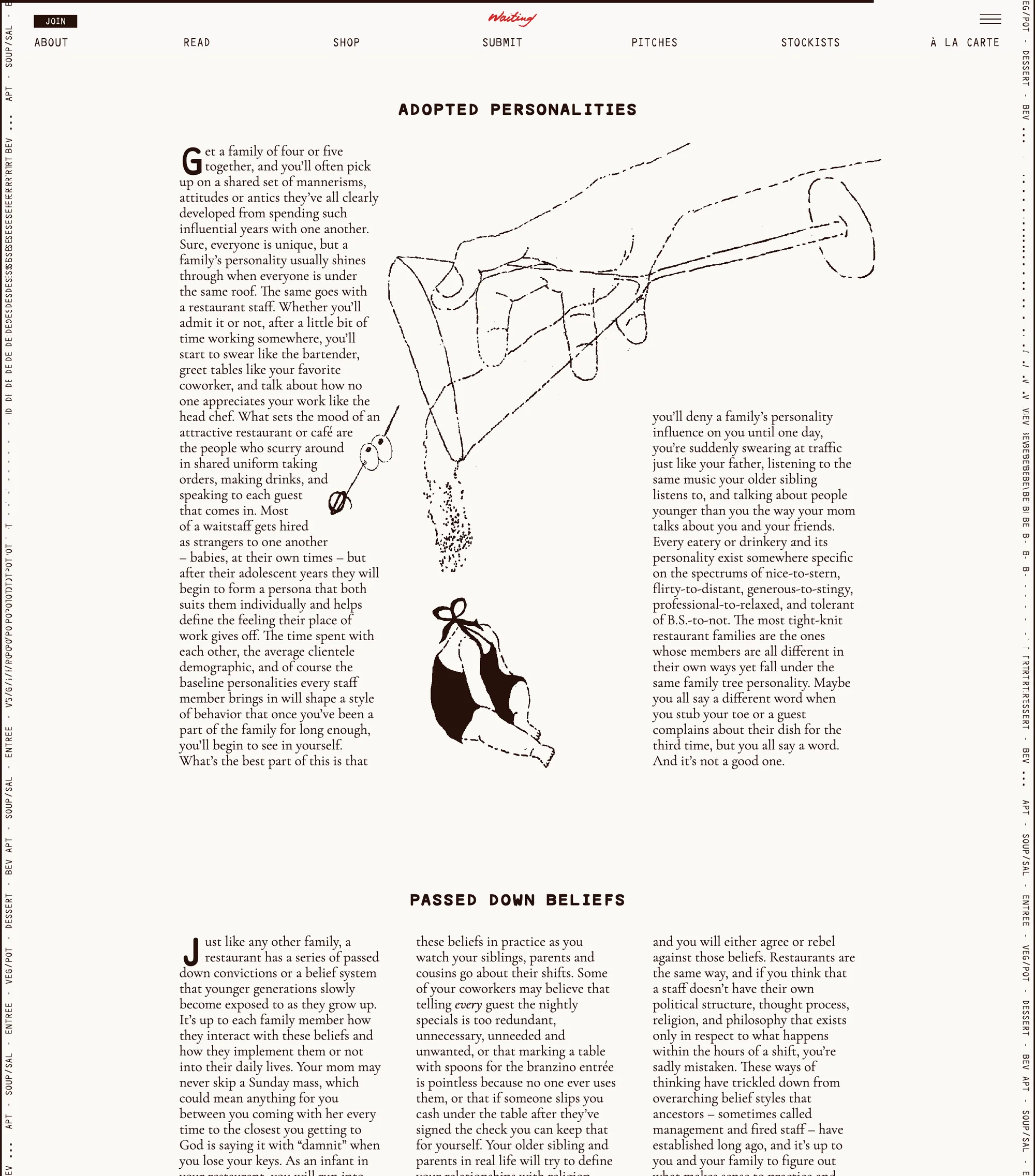
Like the wordmark, our titles trail off: Editor’s Letter…, Black Clogs…, Family Style…, Are You Waiting…?

Family Style on waitingmag.com, with the martini illustration
Print

Let quotes break the column

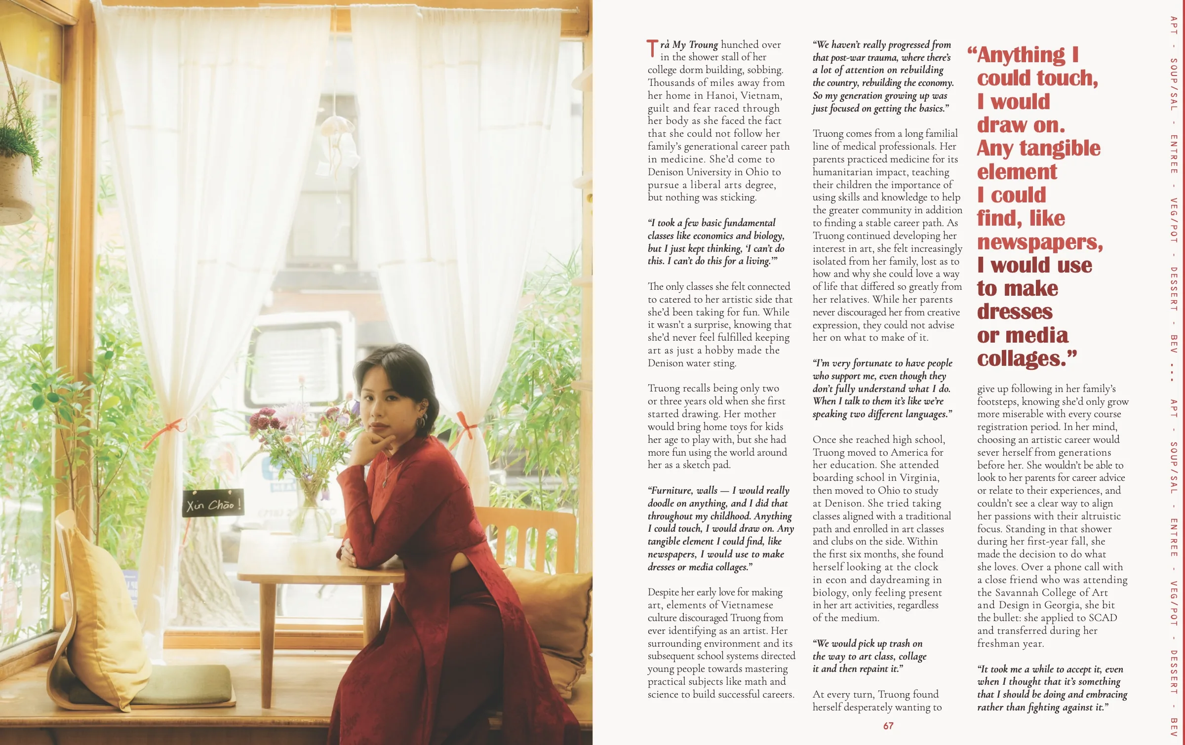
Hero quotes in Britannic interrupt long stretches of story text. Set them in the story’s accent color, large enough to read from across the spread.

Trà My Truong spread with a red hero quote
Three columns with a hero quote. Trà My Truong, Edition 3.
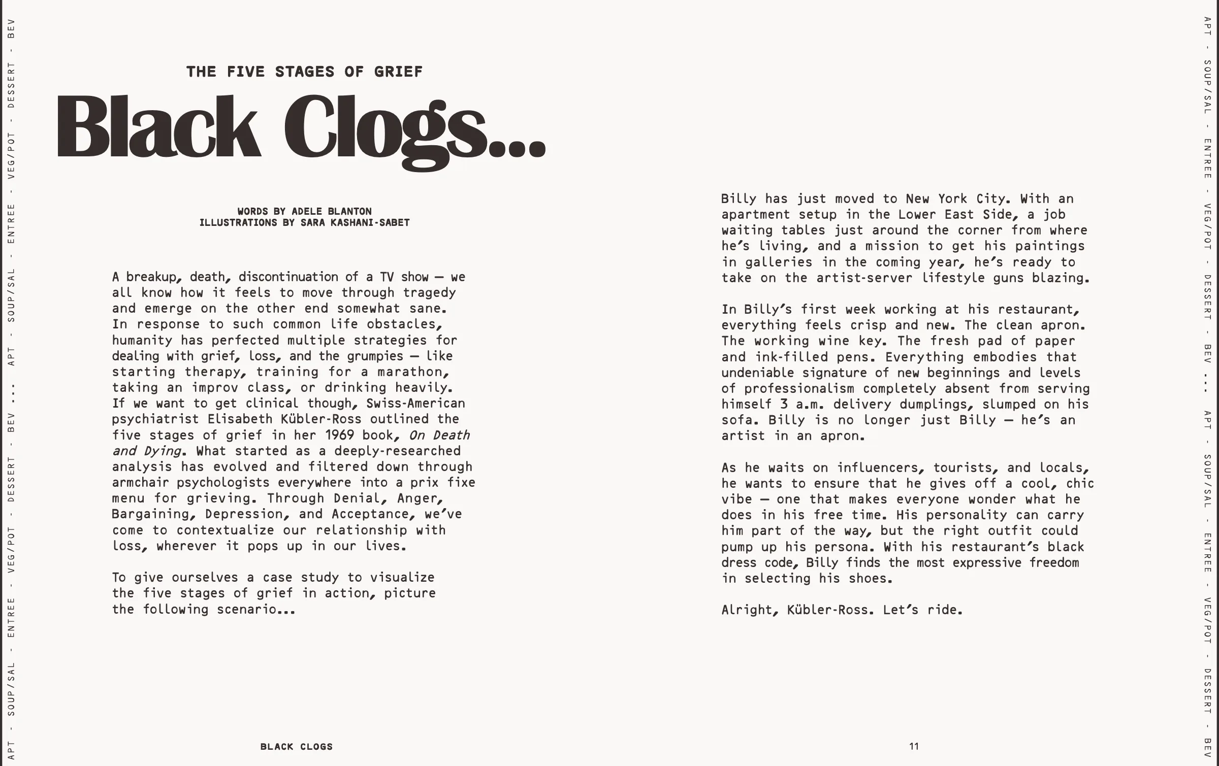
Black Clogs spread set in Waiting Regular
Two columns in Waiting Regular. Black Clogs, Edition 3.
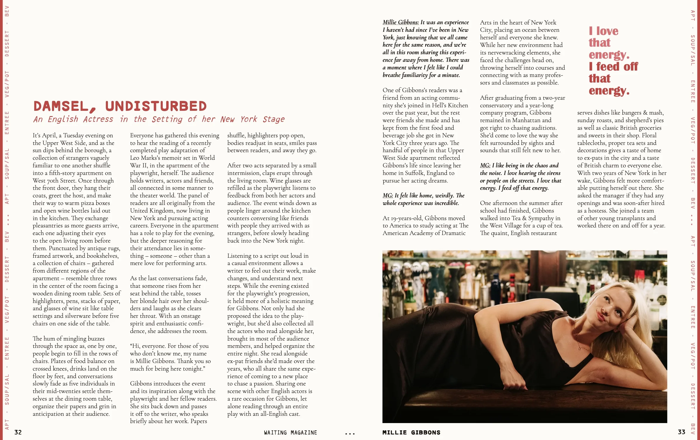
Millie Gibbons spread with a red pull quote
Three columns with a pull quote. Millie Gibbons, Edition 2.
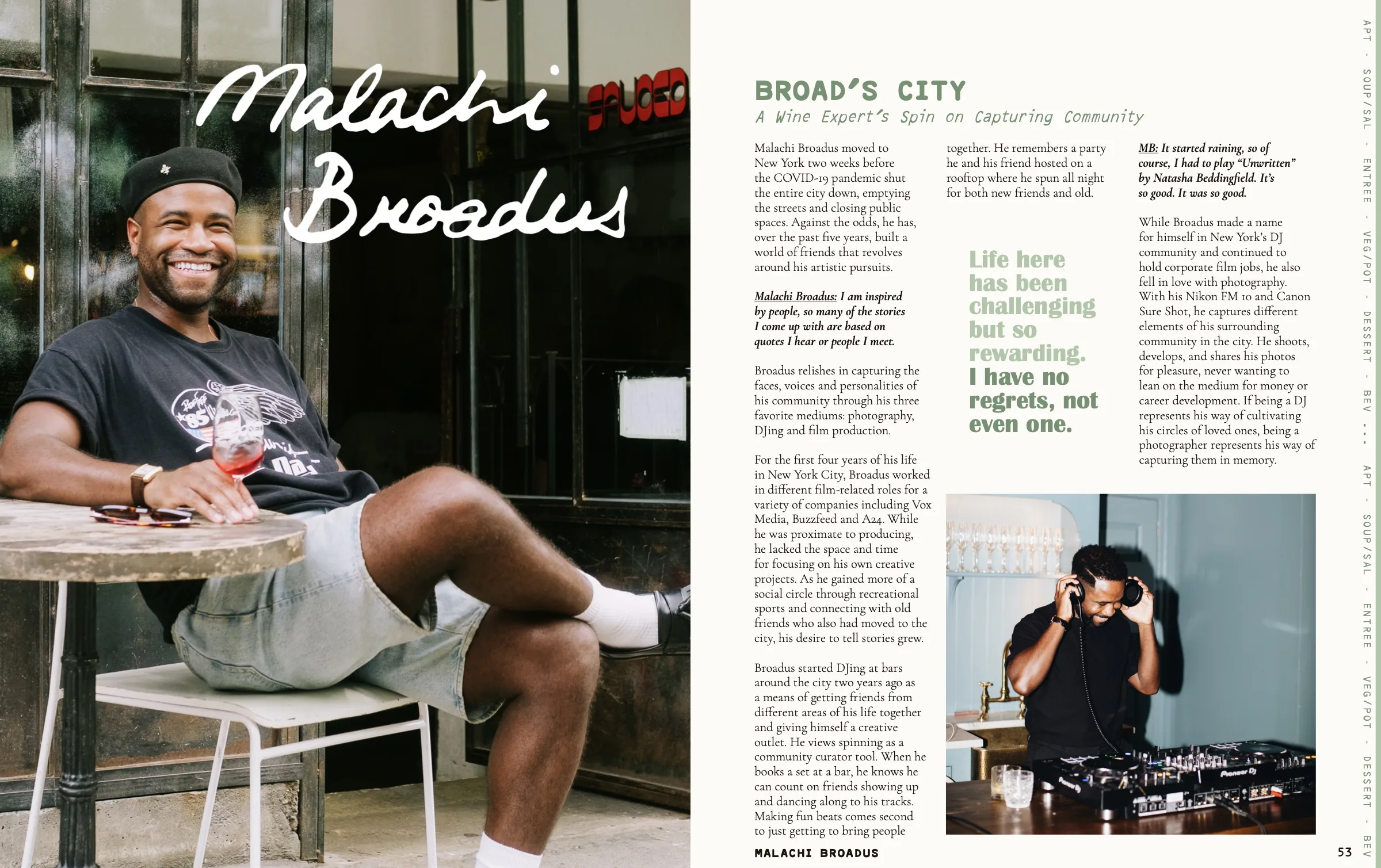
Malachi Broadus opener with a green pull quote
Opener with a pull quote. Malachi Broadus, Edition 2.
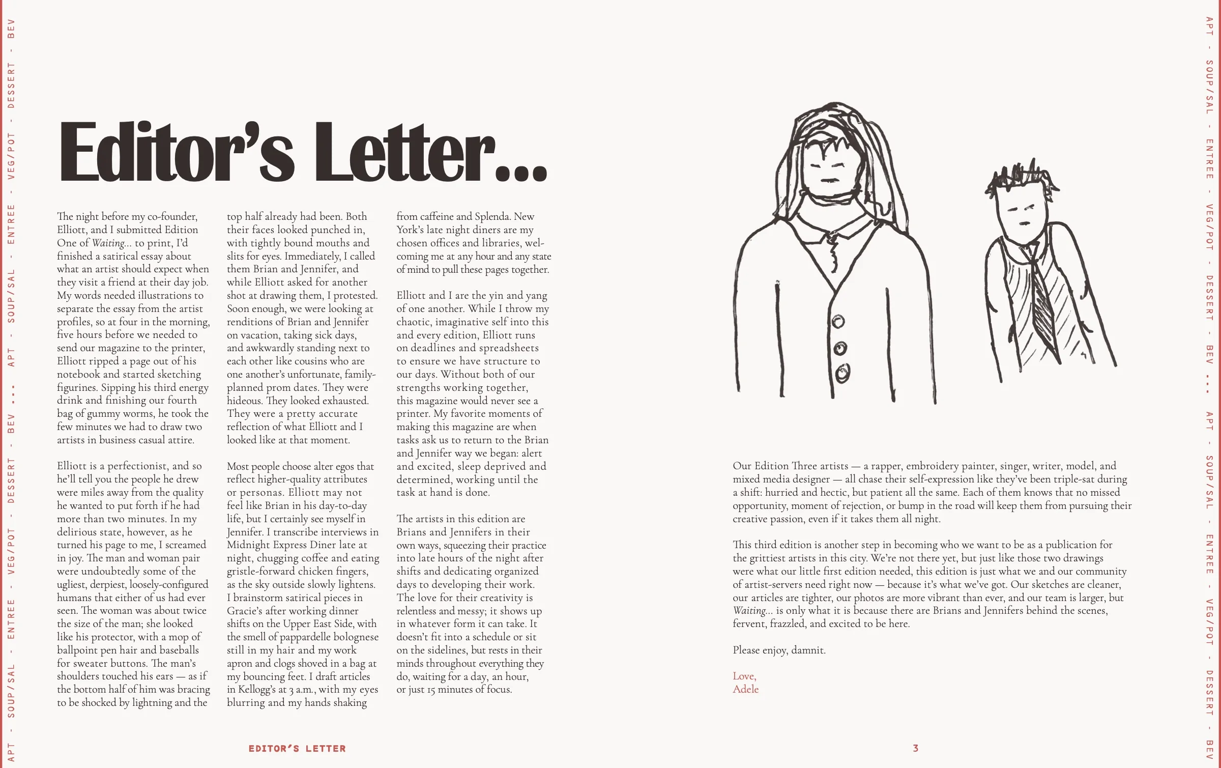
The Editor's Letter from Edition 3
Letter with illustration. Edition 3.